
The middle decades of the 20th century were boom times for Americans. Partly this is because much of the rest of the industrialized world had been devastated by World War II, but actually recovering from that devastation meant that economic growth rates were pretty good even in Europe and Japan after the war. Even better, for once a rising tide really did lift all boats. Low-, middle-, and high-income people all saw major gains from economic growth, and low-income people working people actually saw their income grow a little faster in percentage terms than their higher-income counterparts.
Since roughly 1980, however, the spread between rich and poor has been getting worse. Consider just the 2000s: Below is a graph showing the change in real per capita gross domestic product for the United States. That is, it’s the total amount of economic activity in the United States adjusted for inflation and divided by the size of the population:
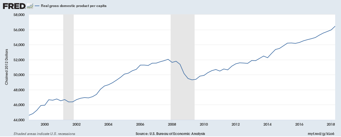
This is an increase of over 25 percent on top of inflation, which is pretty good considering we went through a very bad recession starting in 1998 that was on its way to becoming a deep depression had the government not adopted a massive economic stimulus early in the Obama administration. (The last months of the Bush administration did some serious bailing as well.)
If the distribution of income had stayed the same, everyone would be about 25 percent better off in terms of gross income. The very rich would still be vastly better off than the poor or middle class, but every group would be doing the same percentage better relative to a couple of decades earlier.
But of course we’re not all equally better off. Quite the contrary, as the graph below illustrates. It was created by blogger Kevin Drum based on census data you can find here.
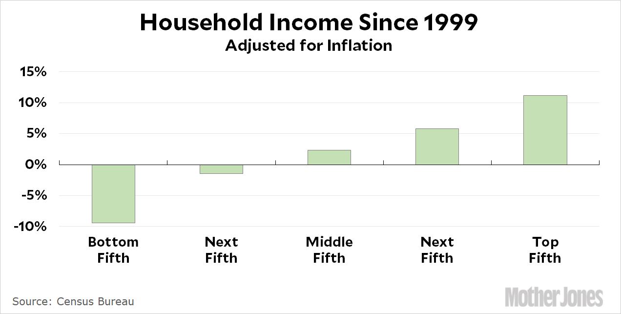
The rich are getting richer, the poor are getting poorer, the people in the middle are doing a little better, and the top fifth of the population saw their income rise by about 11 percent.
But wait a minute. This looks like nobody is enjoying that 25 percent income increase you might expect us all to share in. How is that possible? The answer, of course, is that the vast majority of that additional income was captured by the narrow sliver of the population at the very top. These are of course also the very same people enjoying almost all the benefits of last year’s massive tax cuts for wealthy individuals and corporations.
(Updated 2018 October 24 in my usual attempt to make what I wrote a bit clearer.)